Sizing
When designing shirts, size matters a lot. The size of your design should depend on the nature of your design and the type of garment it will be printed on. Your design may come out looking larger than it should so it is always a good idea to stick with a medium sized design. For bulk orders with smaller items you may want to reduce the print size so you have the same print on every size from Small all the way to 3XL.
Placement
When designing shirts, size matters a lot. The size of your design should depend on the nature of your design and the type of garment it will be printed on. Your design may come out looking larger than it should so it is always a good idea to stick with a medium sized design. For bulk orders with smaller items you may want to reduce the print size so you have the same print on every size from Small all the way to 3XL.
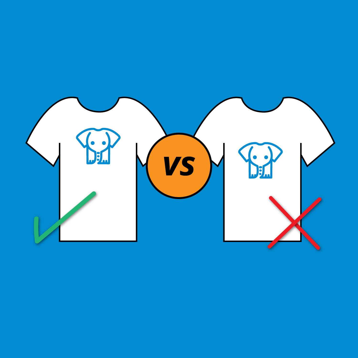
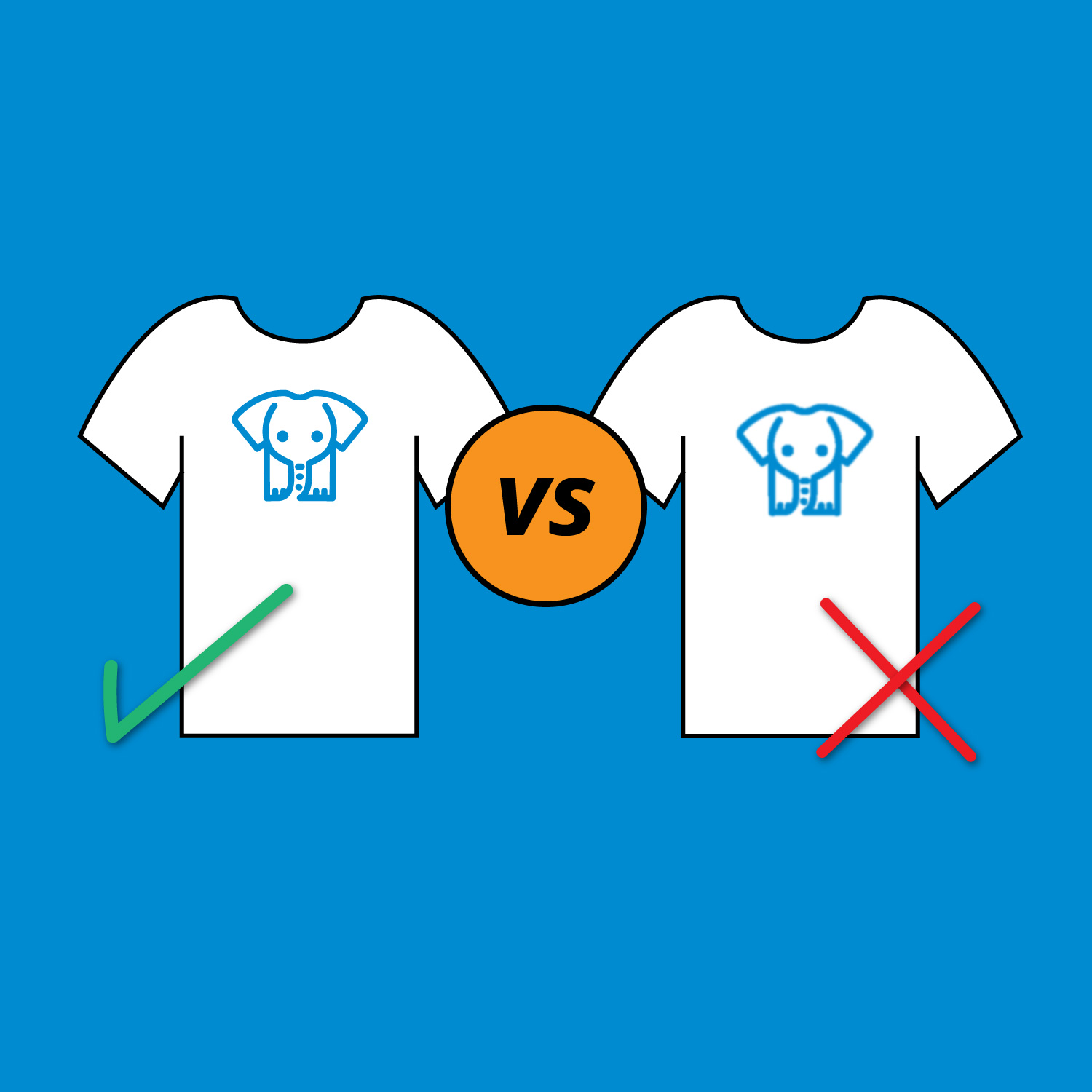
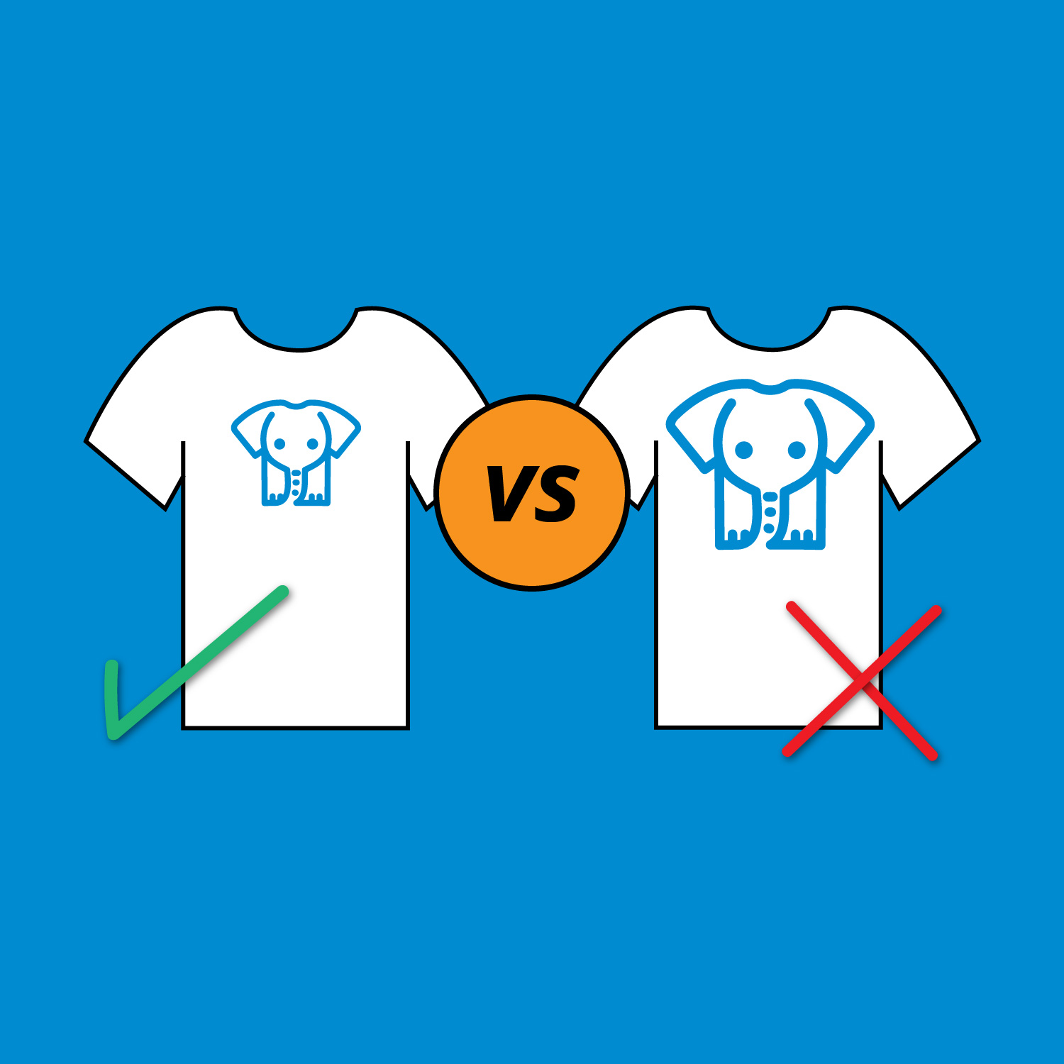
Image Quality
Print placement is the specific area on which your design will be printed onto the shirt. There are standard placement guidelines that every printer follows. Designs should generally be 2” below the collar of a shirt, and 7” - 10” in width. If you do have alternate requests for very specific design needs you can always let us know the specific measurements you require in the “notes” section in the design studio, or send us an email ([email protected])
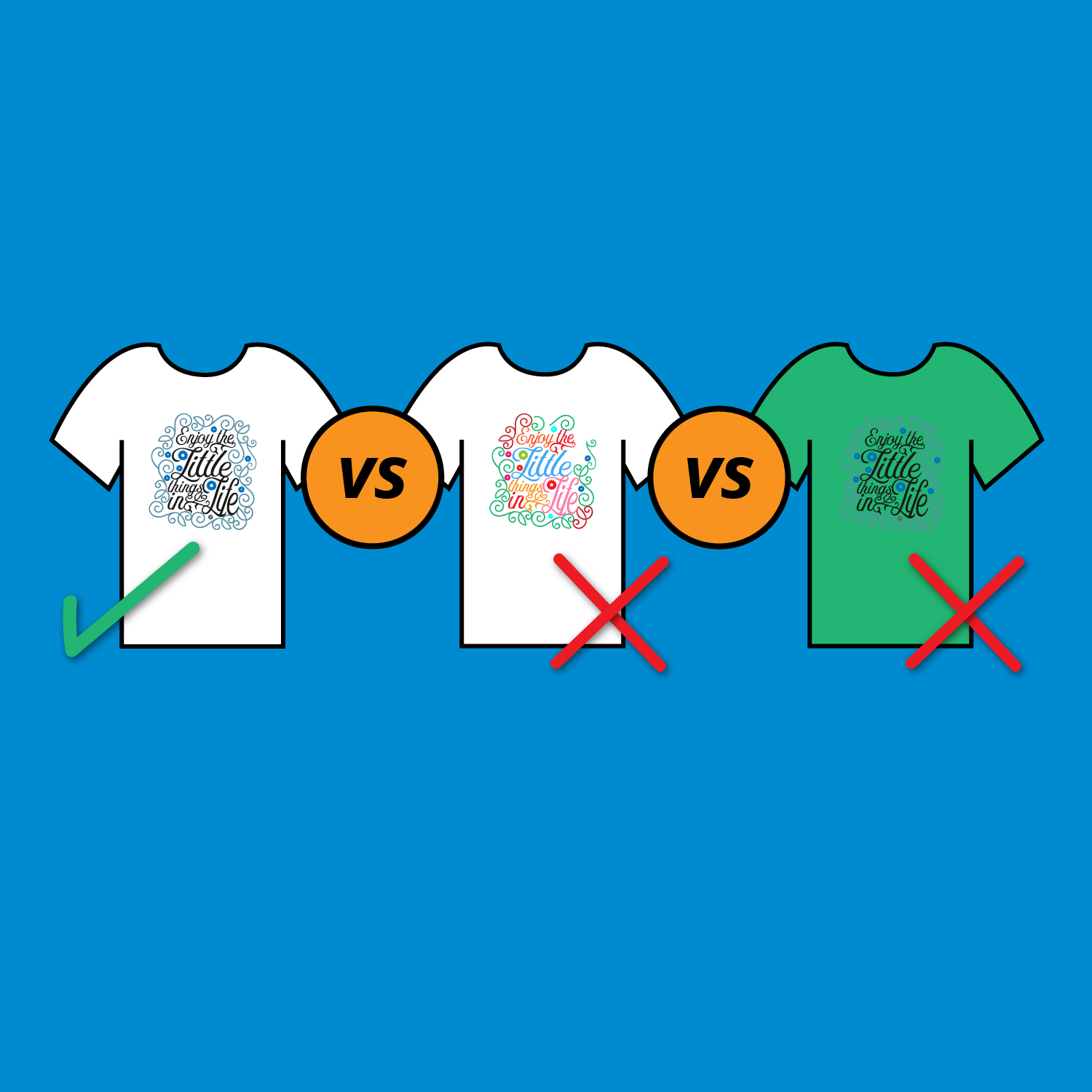
Colours
Another very important factor when designing a shirt is colours. The colours in a design will not only affect your design, it can also affect your cost. When screen printing, the more colours you include the higher the cost per item. It may be tempting to use all of the colours, but we always find that you get the best results when using less. Also, you should be very mindful of what colour garment you will be selecting, it should always complement the design.
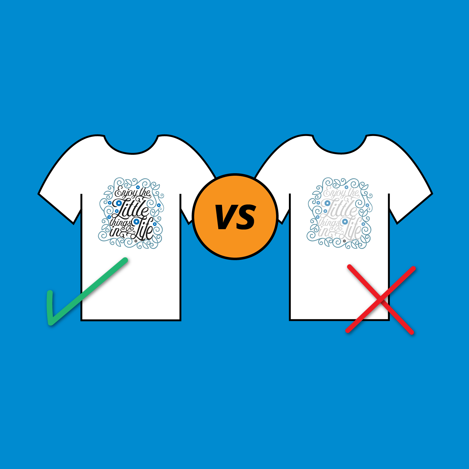
Contrast
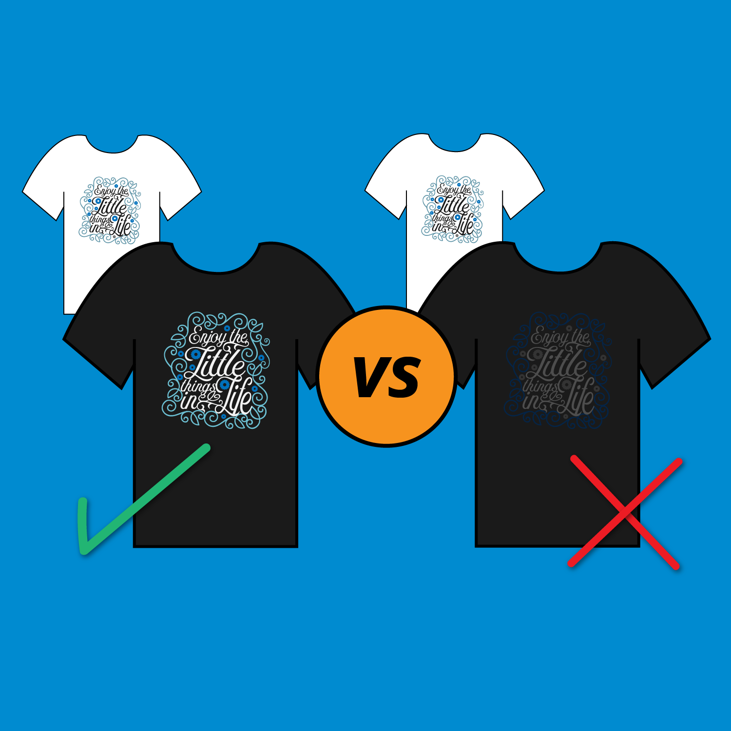
Contrast is the visual difference between the darker and lighter part of your design. An eye catching image with highly saturated colours will really stand out on a neutral background or shirt. Typical contrast mistakes are: Navy Blue on a Black shirt, Light Grey on Athletic Heather shirts, and Light Grey on White shirts - these never show up as expected and sometimes look as if they weren’t even printed.
Inversion
If you are printing on multiple coloured shirts then you should have multiple versions of your design, especially if some of the shirts are black (or dark colours), and others are white (or lighter colours). For light coloured shirts your design should have dark contrasting colours, while darker shirts should have lighter colours. If your design is not inverted properly the design might look completely different than you intended. If you need help creating inversions of a logo or design for your order feel free to contact us ([email protected]) and our design team can help.