Why Colours Vary Between Orders
You ordered custom t-shirts six months ago and loved them. Now you're reordering the same style in the same color, but something looks... off. The new shirts are slightly different. What happened?
Color inconsistency in reorders is one of the most common challenges in custom apparel. Understanding why this happens helps you minimize variations and set realistic expectations.
Dye Lot Variations
Every fabric batch goes through a dyeing process. Even when manufacturers use identical dye formulas, slight variations occur between batches:
- Temperature fluctuations: Dye baths operate within specific temperature ranges, but even small variations affect color absorption
- Humidity levels: Environmental conditions during dyeing influence how fabrics take on color
- Raw material differences: Cotton from different harvests or polyester from different chemical batches absorbs dye slightly differently
- Dyeing equipment: Different machines or even different positions within the same dye bath can produce subtle variations
Industry Standard
A 2-3% color difference between dye lots is considered acceptable in the apparel industry. This variation is often imperceptible when items aren't placed side-by-side, but becomes noticeable in direct comparison.
Different Suppliers or Manufacturers
Even if you order the same brand and style, your supplier may source from different manufacturing facilities:
- Major brands like Gildan operate multiple factories globally
- Each facility may use slightly different dye suppliers or processes
- Color named "Navy" from one facility may differ slightly from another
- Seasonal production shifts between facilities can cause mid-year color changes
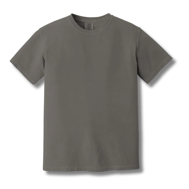
Fabric Type Affects Color Absorption
Different fabric compositions absorb and display color uniquely:
100% Cotton
- Absorbs dye deeply into fibers
- Colors appear matte and soft
- More susceptible to fading over time
- Easiest to match consistently
100% Polyester
- Dye sits on surface of synthetic fibers
- Colors appear brighter and more vibrant
- Excellent colorfastness
- Can vary based on fabric weave
Cotton-Poly Blends
- Natural and synthetic fibers absorb dye differently
- Blend ratio affects final color appearance
- 60/40 looks different from 50/50 in same dye
- Most challenging for exact color matching
Heather Fabrics
- Mix of dyed and undyed fibers
- Color varies by individual fiber distribution
- Nearly impossible to match exactly
- Intentional "vintage" inconsistency
Screen Printing vs DTF Color Differences
The decoration method significantly impacts color appearance and consistency:
Screen Printing
- Ink mixing: Custom mixed Pantone inks should be identical, but slight human error in mixing affects consistency
- Ink age: Older inks may have different viscosity or slight color shifts
- Application pressure: Different squeegee pressure creates lighter or heavier ink deposits
- Cure temperature: Heat curing can slightly alter final ink color
DTF (Direct-to-Film)
- Digital consistency: Computer-controlled printing offers more consistent CMYK color reproduction
- Printer calibration: Each printer calibrates differently, causing variations between vendors
- Ink cartridge batches: New ink cartridges may differ slightly from old ones
- Film application: Heat press temperature and pressure affect final appearance
Pro Tip
For the most consistent reorders, stick with the same printing method. If your original order was screen printed, reorder with screen printing rather than switching to DTF, even if DTF is cheaper. The printing method difference will be more noticeable than any cost savings.
The Pantone Matching System Explained
The Pantone Matching System (PMS) is the global standard for color communication in design, printing, and manufacturing. Understanding how to use it correctly is crucial for consistent reorders.
What Are Pantone Codes?
Pantone assigns unique identification numbers to specific colors. Instead of saying "bright red," you specify "Pantone 185 C" - a universally recognized color formula that printers and manufacturers worldwide can reference.
- Universal language: Eliminates ambiguity in color communication across vendors and countries
- Standardized formulas: Each Pantone color has a precise mixing formula for inks and dyes
- Physical references: Pantone swatch books provide physical color samples for accurate matching
- Digital limitations: Screen displays cannot accurately show Pantone colors - always use physical swatch books
How to Find Your Brand's Pantone Colors
If You Have Existing Brand Guidelines:
- Check your brand style guide for specified Pantone codes
- Verify codes with a current Pantone swatch book (colors can be updated)
- Note whether colors are specified as "C" (coated) or "U" (uncoated)
If You're Starting Fresh:
- Work with a designer: Professional designers have Pantone libraries and can recommend appropriate colors
- Visit a print shop: Many printers have Pantone books you can browse to select colors
- Order a Pantone book: Investment ranges from $150-300 for complete swatch books
- Match existing items: Bring physical samples to a printer who can identify the closest Pantone match
Converting Digital Colors:
- RGB (screen colors) and CMYK (print colors) don't translate perfectly to Pantone
- Use Adobe Photoshop or Illustrator's built-in Pantone color libraries
- Always verify digital conversions with physical Pantone swatches
- Understand that "close" isn't exact - screens deceive
Pantone Coated vs Uncoated
Pantone C (Coated)
- For glossy, coated paper stocks
- Use for screen printing on apparel
- Colors appear brighter and more vibrant
- Most common for t-shirt printing
Pantone U (Uncoated)
- For matte, uncoated paper stocks
- Colors appear softer and more muted
- Better reference for fabric absorption
- Useful for embroidery thread matching
Limitations of Pantone Matching
While Pantone is the industry standard, it has important limitations for apparel:
Critical Understanding
Pantone formulas were developed for ink on paper, not dye on fabric. A perfect Pantone match is often impossible on textiles, especially across different fabric types. Expect close approximations rather than exact matches.
- Fabric texture matters: The same Pantone color looks different on smooth vs textured fabric
- Fabric color affects outcome: Pantone formulas assume white backgrounds; colored fabrics alter appearance
- Dye vs ink differences: Fabric dyes absorb into fibers differently than inks sit on surfaces
- Thread limitations: Embroidery thread manufacturers offer "Pantone-matched" threads, but exact matches are rare
- Metallic and fluorescent challenges: Special Pantone colors are extremely difficult to reproduce on fabric
Best Practices for Pantone Color Management
- Specify Pantone codes for all brand colors in your style guide
- Keep a physical Pantone swatch book updated (colors are reformulated periodically)
- Request strike-off samples (color tests on actual fabric) before large production runs
- Understand that "Pantone-matched" means "as close as possible on this fabric"
- Archive physical samples of approved colors for future reference
- Test colors under multiple lighting conditions before approval
Documenting Your Orders for Perfect Reorders
Proper documentation is your best defense against reorder inconsistencies. Creating a comprehensive record of each order ensures you can communicate exactly what you need when reordering months or years later.
Essential Information to Record
1. Product Specifications
- Brand and style number: "Gildan 5000" not just "cotton t-shirt"
- SKU or item code: Specific product identifier from manufacturer
- Color name and code: "Navy" plus manufacturer's color code if available
- Size breakdown: Record which sizes you ordered and in what quantities
- Fabric weight: 5.3 oz, 4.5 oz, etc.
- Fabric composition: 100% cotton, 50/50 blend, exact percentages
2. Decoration Details
- Printing method: Screen printing, DTF, embroidery, heat transfer
- Pantone color codes: For every color in your design
- Ink formulas: Ask your printer to save custom mixed ink formulas
- Thread colors: Brand, color name, and color number for embroidery
- Placement specifications: Exact measurements for logo placement
- Size specifications: Width and height of prints/embroidery
3. Supplier Information
- Printer/vendor name: Full business name and contact
- Order date: When the original order was placed and received
- Order number: Your printer's internal order reference
- Sales rep contact: Specific person who handled your order
- Special instructions: Any custom requests or modifications
Photography Best Practices
Photos are critical for color reference, but only if taken correctly:
Do This
- Photograph in natural daylight (outdoors or near window)
- Shoot between 10am-2pm for consistent lighting
- Include a white reference (paper, card) in frame
- Take multiple shots from different angles
- Capture close-ups of print details and colors
- Photograph shirts flat and on body
Avoid This
- Indoor artificial lighting (fluorescent, LED)
- Flash photography (distorts colors)
- Low-quality phone camera settings
- Heavily edited or filtered photos
- Photos in colored rooms (walls affect color perception)
- Single photo as sole reference
Keeping Physical Samples
Nothing beats a physical sample for color matching. Create an archive system:
- Store properly: Keep samples in dark, dry location to prevent fading
- Label thoroughly: Attach tags with order date, style number, Pantone codes
- Keep multiple pieces: One to send to vendors, one to keep archived
- Include defects: Sometimes "defective" items show important production details
- Protect from handling: Store in plastic bags or garment bags to prevent wear and color transfer
Digital Organization System
Create a reorder folder for each product or project:
Suggested Folder Structure
📁 2025-Staff-Uniforms
├── 📁 Original-Order-Invoice
├── 📁 Product-Specs-Sheets
├── 📁 Photos-Natural-Light
├── 📁 Design-Files (AI, EPS, PDF)
├── 📁 Pantone-References
├── 📁 Vendor-Communications
└── 📄 Reorder-Checklist.pdf
Archive Lab Dip Records
For custom-dyed garments or critical color matching:
- Lab dips are fabric swatches dyed to your specifications before full production
- Keep all approved lab dips with detailed notes on date and batch
- Record any adjustments requested between lab dip versions
- Include lab dip number and dye formula if provided by manufacturer
- Store lab dips the same way as finished product samples
Saving Dye Formulas and Print Screens
Work with your vendors to preserve production assets:
- Screen printing screens: Many printers store screens for reorders (ask about storage fees)
- Ink mixing formulas: Request written formulas for custom-mixed inks
- Embroidery files: Get digitized embroidery files saved to your account
- DTF film masters: Some vendors keep digital files; others purge after 90 days
- Custom color recipes: For dyed garments, request the dye recipe from manufacturer
Handling Discontinued Styles
It's a frustrating reality: you've built your brand around a specific t-shirt style, documented everything perfectly, and now your supplier informs you the style has been discontinued. Here's how to navigate this challenge.
Why Styles Get Discontinued
- Manufacturer updates: Brands refresh their lines every 2-5 years with "improved" versions
- Low sales volume: Unpopular colors or styles get dropped from catalogs
- Production costs: Rising manufacturing costs make some styles unprofitable
- Supply chain issues: Material sourcing problems can end production
- Trend changes: Fashion preferences shift (e.g., classic fit vs retail fit)
Finding Alternative Styles
Work with Your Printer First
Your printing partner has the most insight into comparable alternatives:
- They know which styles have similar fabric weight and feel
- They understand which colors match closest across brands
- They can recommend styles compatible with your printing method
- They may stock similar styles from other manufacturers
Check Manufacturer Replacement Recommendations
Manufacturers often suggest direct replacements:
- Visit the manufacturer's website for "replacement" or "substitute" guides
- Call the manufacturer's customer service for official alternatives
- Understand that "replacement" may have subtle differences in fit or feel
- Request sample garments before committing to large quantities
Cross-Brand Comparisons
Common Style Alternatives
If Gildan 5000 is discontinued, consider:
• Gildan 5000 update/replacement (often same item, new number)
• Fruit of the Loom 3930
• Hanes 5250
• Jerzees 29M
If Bella+Canvas 3001 is discontinued, consider:
• Next Level 3600
• American Apparel 2001
• Canvas 3001CVC (similar style, different blend)
Requesting Samples Before Large Orders
Never assume an alternative will match without testing:
- Order blank samples first: Compare fabric weight, texture, and fit
- Test print on alternatives: Request small print runs on new styles to check color matching
- Wear test samples: Wash and wear samples to evaluate shrinkage and durability
- Compare side-by-side: Put original and alternative together in natural light
- Test in intended environment: If for outdoor use, test outdoors; if for office, test under fluorescent lights
Transition Strategies
When perfect matching isn't possible, plan your transition:
Gradual Rollout
- Transition by department or location rather than company-wide
- Designate new style for new hires, keep original for existing staff
- Use seasonal changes as natural transition points
- Communicate changes to team members in advance
Complete Rebrand
- Sometimes a fresh start is better than close-but-not-quite matches
- Coincide with company rebrand or anniversary
- Offer new style as an "upgrade" rather than forced change
- Donate or recycle old inventory responsibly
Stock Up Strategy
- When discontinuation is announced, calculate 1-2 years of inventory needs
- Order excess blank garments for future decoration
- Consider storage costs vs future unavailability
- Be aware of fabric degradation over long-term storage
Important Consideration
Stockpiling discontinued styles can backfire if your needs change, sizes don't match future team composition, or blanks deteriorate in storage. Balance future-proofing with flexibility. For most businesses, 6-12 months inventory is a safer maximum.
Planning Ahead for Critical Items
- Diversify early: Don't build your entire brand on a single style from one manufacturer
- Monitor manufacturer communications: Subscribe to supplier newsletters announcing style changes
- Review annually: Check if your styles are still in active production each year
- Build relationships: Vendors often get advance notice and can warn you
- Document alternatives now: Identify backup styles while your primary is still available
Switching Vendors: What to Expect
Sometimes you need to switch printing vendors - better pricing, faster turnaround, or service issues with your current printer. Understanding what changes to expect helps you manage the transition smoothly.
Why Colors May Differ with New Vendors
Different Equipment and Calibration
- Screen printing: Each shop uses different squeegee hardness, pressure, and screen mesh counts
- DTF printing: Different printer models, calibration standards, and color profiles
- Embroidery: Machine tension, thread brands, and digitizing preferences vary
- Heat pressing: Temperature and pressure differences affect color appearance
Ink and Material Suppliers
- Vendors source inks from different manufacturers (Wilflex, Rutland, etc.)
- Even with same Pantone formula, base ink chemistry varies by brand
- Thread manufacturers (Madeira, Robison-Anton, Isacord) have different "Pantone matches"
- Substrate suppliers provide fabrics with slight variations in texture and base color
Mixing and Application Techniques
- Human variation in ink mixing affects final color
- Some printers use automated mixing systems, others mix manually
- Different printers apply different ink deposit thicknesses
- Curing techniques and temperatures subtly alter final colors
Minimizing Color Variance
Provide Comprehensive Specifications
New Vendor Transition Checklist
Request Production Samples
Before committing to large quantities with a new vendor:
- Order small test batch: 12-24 pieces to evaluate quality and color
- Compare in multiple lighting: Natural daylight, office fluorescent, and retail LED
- Wash test samples: Ensure colors hold up through laundering like originals
- Get team feedback: Show samples to stakeholders before approving full production
- Allow adjustment time: Good vendors will refine color based on sample feedback
Communication Best Practices
Be Clear About Expectations
- State upfront that you're matching existing inventory
- Explain how critical color accuracy is for your application
- Ask if they have experience with exact color matching
- Discuss their quality control and color approval processes
Establish Color Tolerance Standards
- Define acceptable variance (e.g., "must match within industry standard 2-3%")
- Specify whether samples need formal approval before production
- Clarify who makes final determination if colors are "close enough"
- Agree on remedies if final production doesn't match approved samples
Transition Best Practices
Overlap Period
- If possible, keep your relationship with original vendor during transition
- Order one final batch from original vendor as new vendor ramps up
- This provides bridge inventory if new vendor has matching issues
- Allows you to compare quality side-by-side
Start with Non-Critical Items
- Test new vendor with promotional items or internal merchandise first
- Don't switch mission-critical corporate uniforms or retail products immediately
- Build confidence and refine processes before high-stakes orders
Document Everything
- Keep detailed records of all communications with new vendor
- Save approved sample photos and written approvals
- Document any adjustments or special requests
- Create new order documentation system with new vendor
Success Story
A corporate client switched to T-Shirt Elephant from another printer for better pricing. They provided physical samples, Pantone codes, and detailed specifications. We produced sample garments, made minor ink adjustments based on their feedback, and achieved a match within acceptable tolerance. The key was their thorough documentation and willingness to approve samples before rushing into production.
When Perfect Matching Isn't Possible
Sometimes, despite best efforts, exact matching proves impossible:
- Accept close approximation: If colors are within industry tolerance, consider accepting
- Strategic replacement: Replace entire departments or locations rather than mixing old and new
- Rebrand opportunity: Use vendor switch as excuse to refresh colors slightly
- Maintain relationship flexibility: If matching is critical, be willing to pay premium prices to maintain original vendor
Complete Reorder Checklist
Use this comprehensive checklist every time you reorder custom apparel to ensure consistency and quality.
Before Placing Your Reorder
When Communicating with Your Printer
Upon Receiving Your Reorder
After Successful Reorder
Frequently Asked Questions
Ready to Reorder with Confidence?
At T-Shirt Elephant, we maintain detailed records for every order, save your screens and formulas, and work diligently to match your original colors. Let us help you achieve consistent, quality reorders every time.